
La Esquinita is a fictional Mexican street-food brand identity with the goal to create a welcoming taquería that celebrates homemade flavors, family roots, and the bright energy of a neighborhood corner spot.

Concept & Strategy
The goal was to capture the warmth and vibrancy of traditional Mexican street food while making the brand approachable and modern for a digital audience. I started by exploring themes of community, heritage, and bold flavor, which shaped the visual direction and tone of the identity.
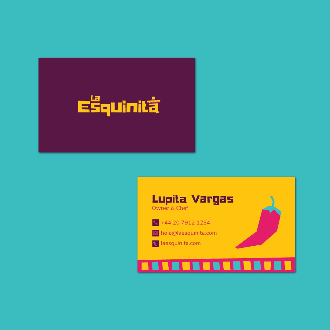
Logo & Visual Identity
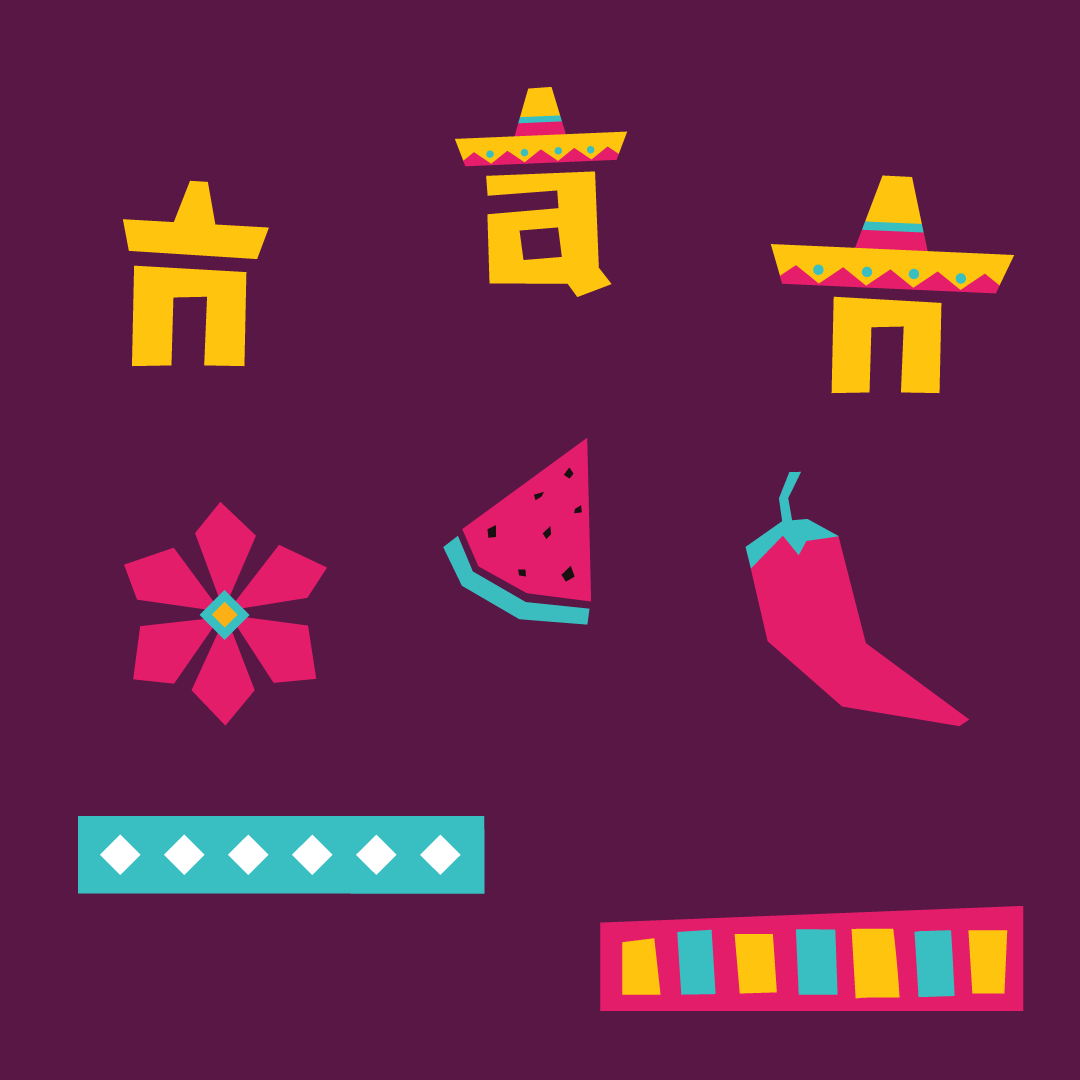
The logo was designed to feel both handcrafted and adaptable — combining playful typography with strong geometric shapes. The color palette draws from the richness of Mexican art and culture with bold bright pinks, yellows and turquoise.
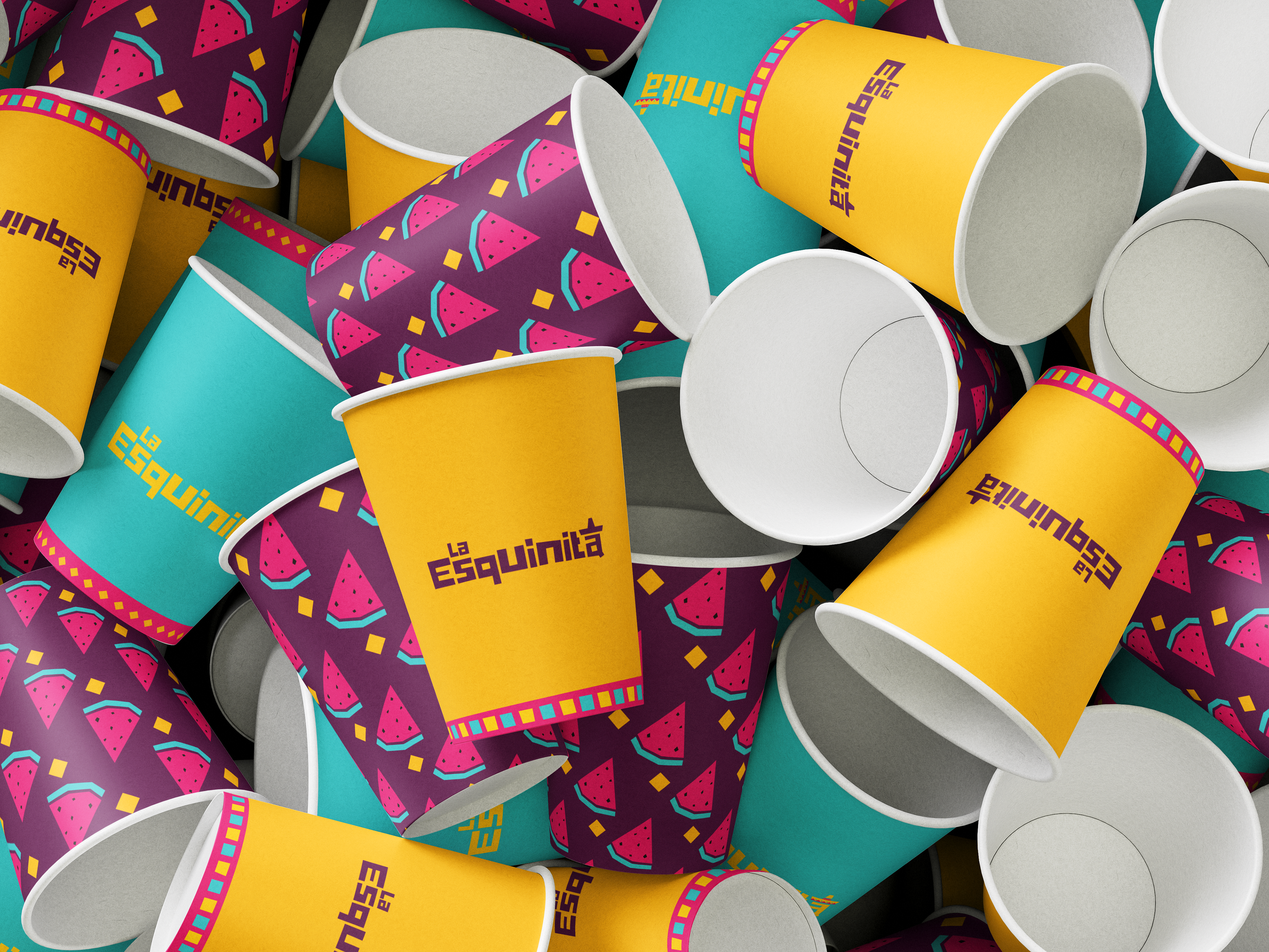
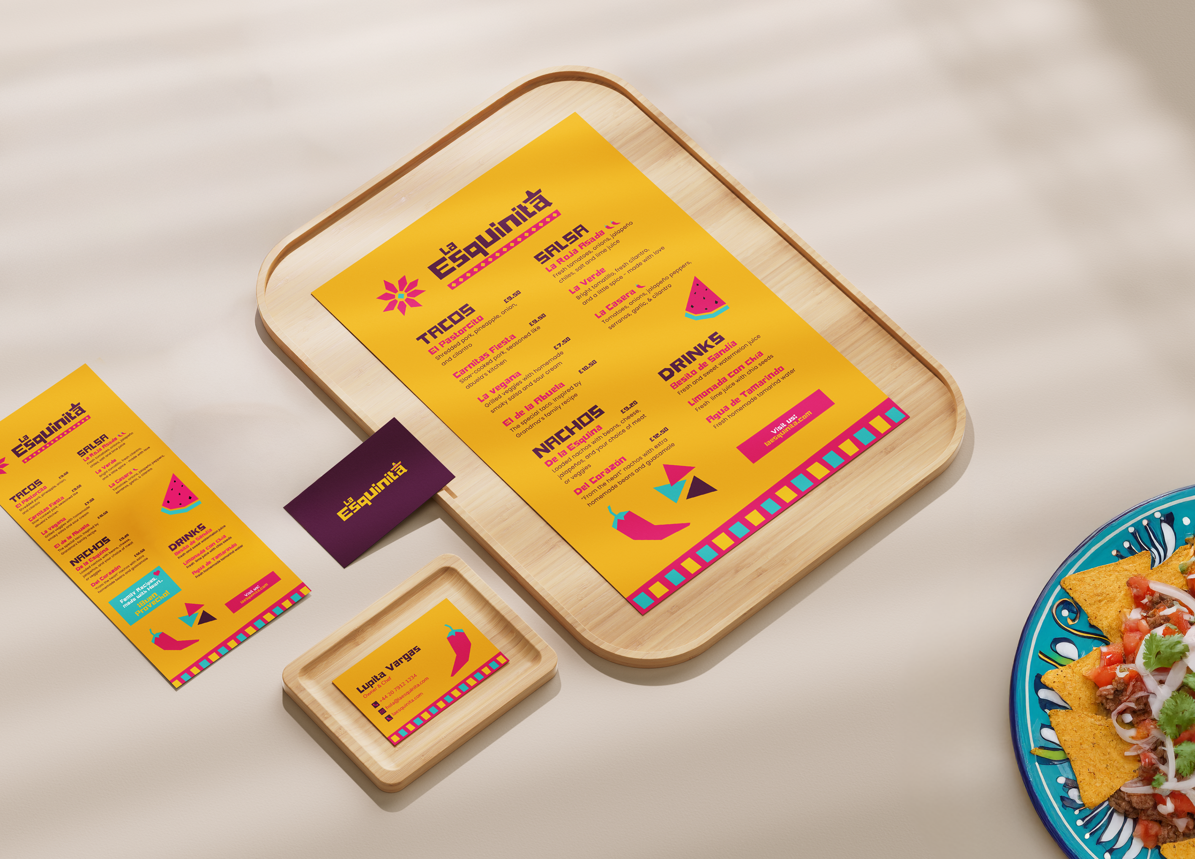
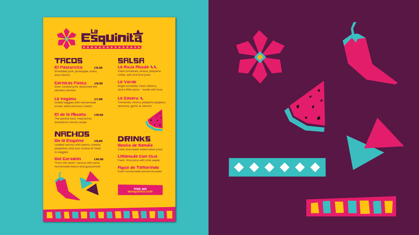
I had fun creating menu layouts and packaging assets that reflect the lively, authentic feel of this taquería. Each design and product is designed to be engaging, consistent, and scalable, ensuring the brand connects both in-person and online.